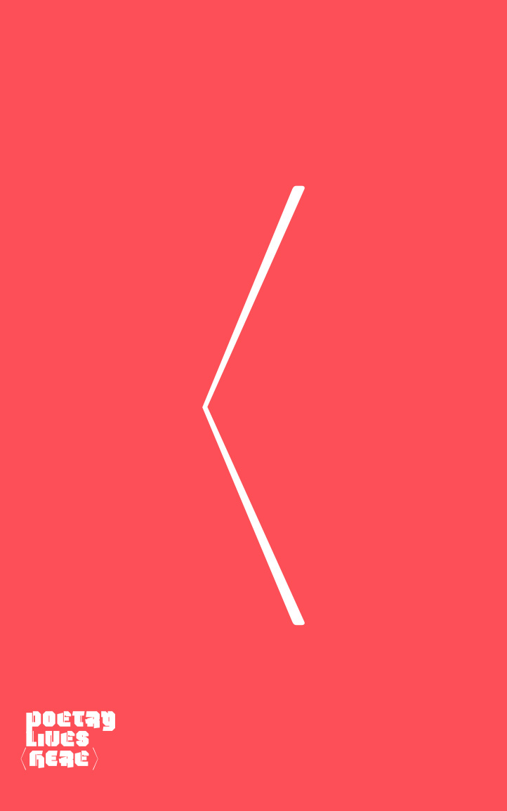
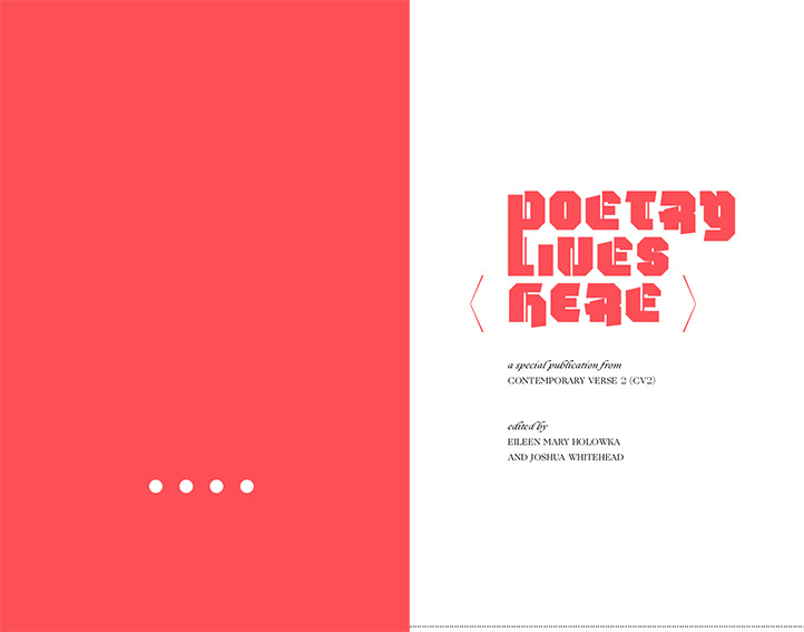
I responded to the idea of the title, “Poetry Lives Here,” by creating a physical indication of “here.” The cover is an opening bracket, with a closing bracket on the back cover.
The work in this publication is from emerging poets. I chose typefaces from Village font foundry’s Incubator collection for emerging type designers.
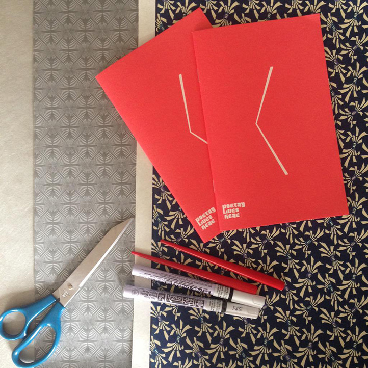
For the launch, we had the authors sign copies with white paint pens and decorated those copies with patterned paper.
A 48-page supplementary publication for the poetry journal Contemporary Verse 2 of writing by poets under 25.